Company: Opscura
Company Type: International Startup
Sector: OT Cybersecurity
Location: Donostia-San Sebastián, Spain. Headquarters in Silicon Valley, USA
Evolution is essential to the growth of all businesses, and it needs to be reflected in the brand. This was our approach when we worked with Opscura, an OT cybersecurity startup, on their exciting rebranding and website redesign project.
Why a rebrand? Startups are part of a dynamic environment and need to keep up with market demand, reflecting the evolution of their products and services. Communication and visual identity must showcase the values and innovation of the product and company, as well as the evolution of the startup.
To present itself in the minds of its audience, IT and cybersecurity decision makers from industrial companies and critical infrastructures, as a consolidated, effective, and easy-to-implement product. A product that is accessible to its audience, without technical jargon, and that demonstrates its benefits immediately and clearly.
The project consisted of defining a new visual identity for all their materials, creating a new logo, and applying the new graphic materials to the existing website.
This project was developed over 8 weeks and was divided into two phases. It involved a project manager, a graphic designer, and two web designers working in a coordinated manner to meet the project’s requirements and deadlines.
We began by working closely with Opscura’s team to identify their needs and goals. We identified the strengths of the existing brand and the areas where change was needed in order to accurately reflect the company’s identity and values.
We developed a new visual identity that captured the essence of Opscura, from the logo design to the color palette and typography. The result was a design that communicates how Opscura simplifies OT security, making it immediate and effective.

The central element of the new visual identity is a spiral with circles, symbolizing Opscura’s ability to gain visibility, collect data, segment, and effectively protect the network in the most complex environments.
The logo was designed to reflect the effectiveness and simplicity of Opscura’s cybersecurity solution, using a clean and modern font along with the spiral as the main element.

The color palette was updated to reflect Opscura’s innovative and accessible nature, with greens symbolizing security and trust, combined with white and gray to convey clarity and effectiveness.
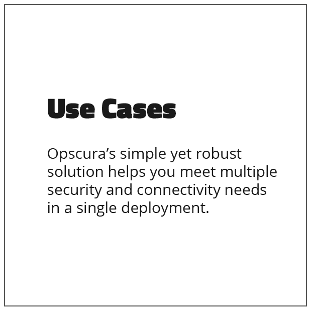
New legible and modern fonts were selected to convey the image of a reliable and forward-thinking company.
We concluded the rebranding project by creating a guide to ensure the correct application of the new visual identity in all aspects of the Opscura brand.
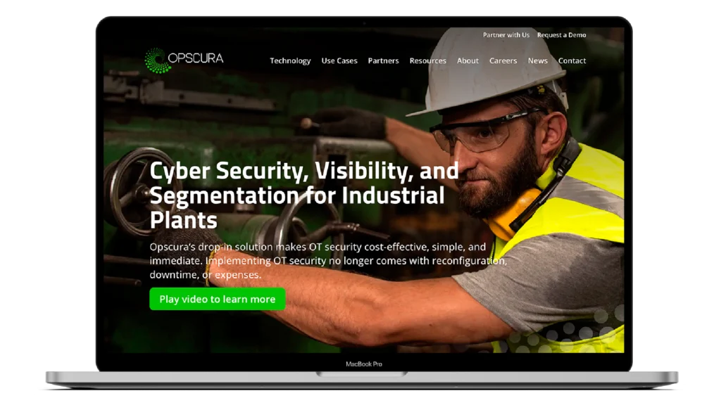
With the new brand in place, we began updating Opscura’s website to reflect the new image.
From the homepage to the secondary pages, we strove to convey the essence of Opscura and its solutions clearly and effectively.
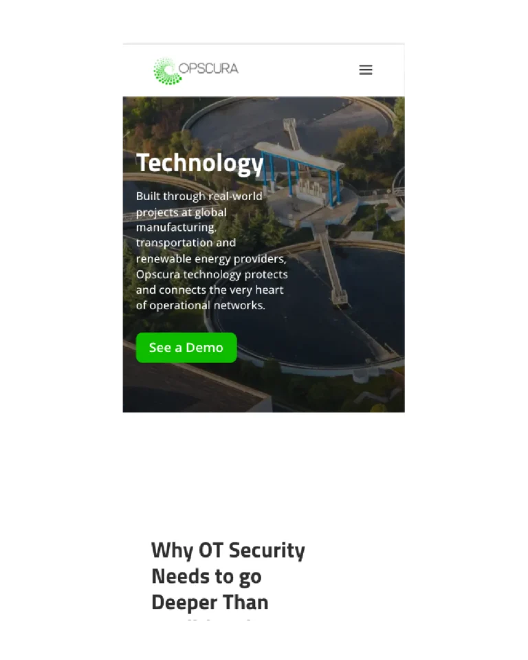
We started the process with the home page, and once the design was approved, extended the application of the new website design to all other pages. In total, we redesigned 9 main pages, over 10 landing pages, and blog pages, as well as elements such as the header and footer.
While redesigning the website, we also took into account the following key points to build a successful website:
This project was implemented in WordPress, taking advantage of the capabilities of various plugins and the Divi editor. The final result turned into a modern and functional website.


We can help you do it in 8 weeks.

MADRID | DONOSTIA-SAN SEBASTIÁN
Zinkup takes digital marketing and communications to the next level. With over 60 success stories in innovative companies and startups like yours, we are ready to achieve your goals.
Do you want to learn everything about digital marketing for startups and innovative companies? Follow us on LinkedIn
We use technologies like cookies to store and/or access device information. Consenting to these technologies will allow us to process data such as browsing behavior or unique IDs on this site. Not consenting or withdrawing consent, may adversely affect certain features and functions.